RSS

Blog posts of '2025' 'March'

5 Common Printing Mistakes and How to Avoid Them

In today's fast-paced business world, high-quality printed materials can make all the difference in creating a strong brand presence. Whether you’re printing business cards, brochures, banners, or promotional items, a well-executed print job speaks volumes about your company’s professionalism. However, even small mistakes in the printing process can result in wasted time, money, and effort.

As a leading Denver printing company, we’ve seen firsthand how certain errors can impact the final product. To help you avoid costly missteps, here’s five common printing mistakes and how to prevent them.

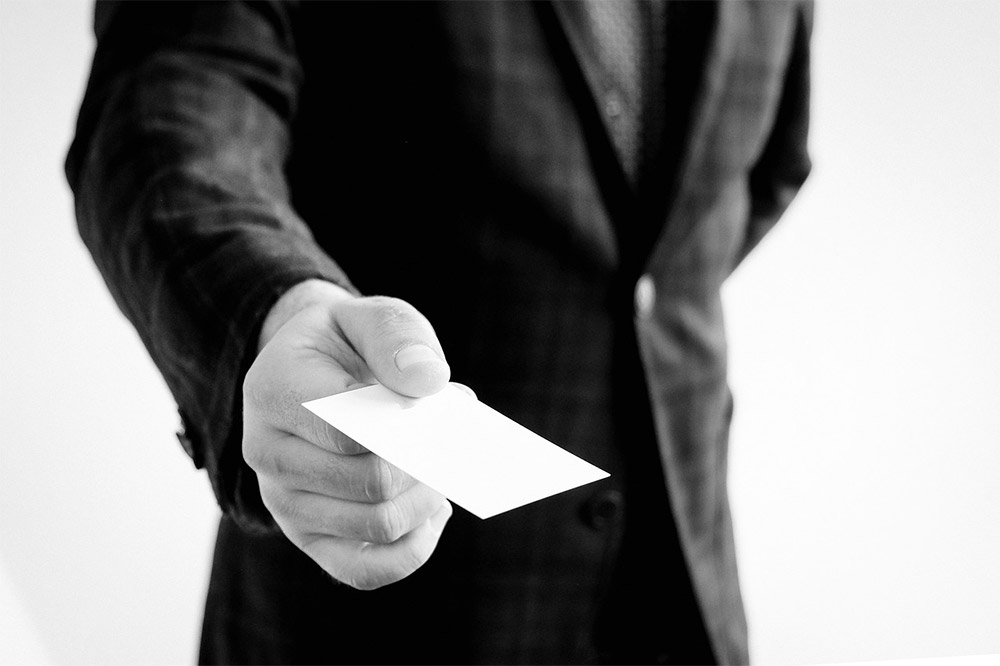
1. Using Low-Resolution Images

One of the biggest mistakes businesses make is using low-resolution images in their print materials. While an image might look sharp on a computer screen, it can become pixelated and blurry when printed, resulting in an unprofessional and unclear final product.

How to Avoid It:

  • Always use high-resolution images (at least 300 DPI or dots per inch) for print materials.
  • Avoid enlarging small images beyond their original resolution, as this can cause distortion.
  • If using images from a website, make sure they are designed for print, as web images are typically 72 DPI, which is too low for quality printing.
  • Work with a professional designer or use stock photos from reputable sources to ensure clarity and quality.

2. Ignoring Bleed and Safe Zone Guidelines

When designing printed materials, many people forget to account for bleed and safe zones. Bleed refers to the extra space beyond the cut line, ensuring the design extends fully to the edge after trimming. The safe zone is the margin inside the cut line where important text and graphics should be placed to avoid getting trimmed off.

How to Avoid It:

  • Include a bleed of at least 1/8 inch (0.125") on all sides of your design.
  • Keep all important text and design elements at least 1/4 inch (0.25") away from the cut line.
  • Use a professional template that includes bleed and safe zone guidelines.
  • When in doubt, consult your printing company to ensure your files are set up correctly.

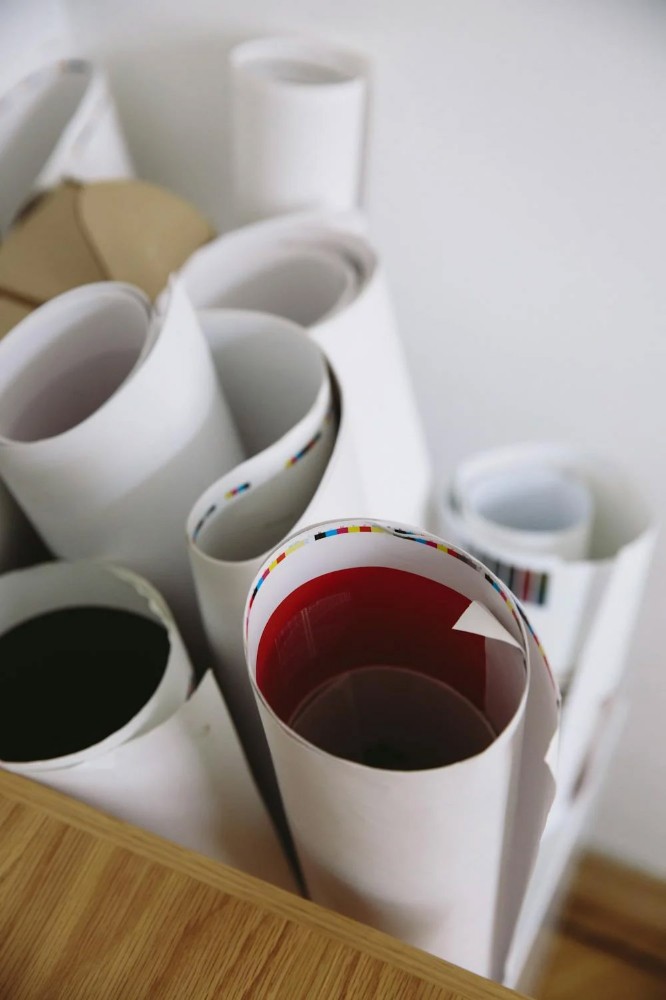
3. Choosing the Wrong Color Mode

There are two primary color modes used in design—RGB and CMYK. RGB (Red, Green, Blue) is used for digital displays, while CMYK (Cyan, Magenta, Yellow, Black) is the standard for print. Designing in RGB and then converting to CMYK can result in color shifts, leading to unexpected results in the final print.

How to Avoid It:

  • Always design print materials in CMYK mode from the start to ensure color accuracy.
  • Use Pantone Matching System (PMS) colors if you need precise brand colors.
  • If you must convert from RGB to CMYK, be sure to preview the changes and adjust accordingly.
  • Work with your printing company to confirm color accuracy before finalizing your order.

4. Overlooking Proofing and Prepress Checks

Skipping the proofing process can lead to spelling errors, misaligned elements, or incorrect colors, resulting in costly reprints. Many businesses assume that their files are print-ready without thoroughly reviewing them, only to discover mistakes after production.

How to Avoid It:

  • Always request a proof before printing—whether it’s a digital proof (PDF) or a physical proof for color accuracy.
  • Check for typos, incorrect spacing, and misaligned elements before approving the proof.
  • Verify that all images and logos are high-resolution and properly formatted.
  • Ask your printing company if they offer prepress checks to catch errors before printing begins.

5. Selecting the Wrong Paper or Finish

The type of paper and finish you choose can significantly impact the look and feel of your printed materials. Using the wrong paper stock can make your materials feel cheap or unprofessional, while the wrong finish may not align with the intended purpose.

How to Avoid It:

  • Consider the purpose of your print materials when choosing paper stock. For example:
    • Business cards should be printed on sturdy cardstock with a professional finish.
    • Flyers should be lightweight for easy distribution.
    • Brochures should have a durable finish for longevity.
  • Choose between matte, gloss, or uncoated finishes depending on the desired look and feel.
  • Work with your printing company to select the best options for your project.

Work with a Trusted Printing Partner

Avoiding these common printing mistakes starts with working with a trusted printing company that understands the nuances of print production. At Cottrell Printing, we provide expert guidance, high-quality materials, and professional printing services to ensure your final product exceeds expectations.

If you’re looking for a Denver printing company that prioritizes quality and customer satisfaction, contact Cottrell Printing today. Whether you need business cards, brochures, banners, or promotional materials, our team is here to bring your vision to life.

Get in touch with us today to start your next printing project!

The Ultimate Guide to Business Card Printing and Design

In today’s digital age, the business card still remains a cornerstone of professional networking and brand representation. A well-designed card can leave a lasting impression while reinforcing your brand’s identity. It can also serve as a physical reminder of your connection. Because of the importance of this first impression, it’s vital that you have an accurate and striking representation of your brand. Working with a Denver commercial printer can drastically improve the impact of your business cards – whether you’re designing your first business card or revamping an existing one.

Why Business Cards Still Matter

Everything seems hyper-focused on the digital world these days, but unlike an email or LinkedIn profile, a business card something you can hold, touch, and keep. This physical connection often adds a sense of authenticity and gives something permanent to professional interactions. Even digital business cards get lost in the shuffle of amongst all of the apps and everything else that’s saved on your phone. They can also have digital touches added to them – like QR codes and other links – to show that you’re connected in the digital age. 

Handing out a business card is still and elegant and efficient way to share contact information. It’s a hallmark of professionalism that demonstrates your preparation and commitment to building relationships. The business card is a miniature billboard for your brand. It’s not just about handing out your contact details. It’s a way of telling your story while showcasing your style. It’s still one of the best ways to leave a lasting visual and tactile impression. 

Essential Elements of a Business Card

There can’t be too much going on within your business card. It should strike a balance between aesthetics and functionality. There are a number of key components that should be included, starting with your contact information. Your name should be prominently displayed, as it should be the focal point of the business card – along with the company’s full name and logo. Be sure to include your title or role within the organization, and include the URL for your website and relevant social media handles. 

Incorporating your brand’s logo, colors, and fonts will ensure consistency with the company’s other marketing materials. You want this consistency across the board, and including it on the business cards shows a level of professionalism and organization throughout all of your marketing. You can also consider adding a subtle call to action on the card to encourage more engagement or follow-up. This can include QR codes that leads them to more information, or something as simple as asking them to visit your website or to connect with you on social media.

Design Principles for an Effective Business Card

More than anything, remember that simplicity is key. This doesn’t mean you have to have just black text on a stark white business card, but it’s crucial to avoid clutter. You want the focus to be on the essential information about the person handing out the card. Use white space strategically to make sure the design is clean and readable. Choose legible fonts that reflect the personality of your branding. Try to use no more than two font types to maintain a professional look and keep the card from getting too busy. Prioritize the elements of the card based on importance. Your name and job title should be more prominent than secondary details like your email address or website. 

Make sure to use the right color scheme that aligns with the identity of your brand. Stick to a maximum of three complementary colors to avoid overwhelming the design. The standard business card is just 3.5 x 2 inches, but alternative shapes have started to make their way into the world. Some people use square cards, or custom-cut cards, but even something as simple as rounded edges can really make your card stand out from the rest. 

Selecting the Right Materials

The material of your business card can significantly impact the item’s look and feel. There are plenty of popular options to get a different feel, starting with the use of a particular paper stock. Matte finish on the paper stock will provide a smooth, non-reflective surface for a modern, more sophisticated look. On the other hand, glossy finish will offer a shiny look that will enhance colors – but may show fingerprints. Textured pater adds a tactile element to your cards that will make your business card more memorable.

There are other non-traditional materials that have become more popular for business cards in recent years. Some opt for a thin piece of plastic. This can be durable and water resistant, but isn’t for everybody. This is a creative option for outdoor and construction industries. Metal has also become a popular material, because it delivers a premium, high-end feel. However, this can get quite expensive, particularly if you’re handing out a lot of cards. There are also a number of eco-friendly options for your business cards – like using recycled paper and soy-based inks. Other eco-friendly options that can make a unique impression are wood and cork, but they have to be executed properly. 

Advanced Business Card Design Tips

Your business card is intended to leave a lasting impression, so be sure to get the most out of them. Use the back of the business card for additional branding, or even a QR code that links to your website and portfolio. Make your business card stand out by using premium finishes. Foil stamping can add a metallic sheen for a more luxurious touch. Embossing or debossing creates a shift in the texture, either raising it or recessing it for a unique look. You can also highlight specific areas with a glossy finish to give it a specific look. 

If appropriate to your industry, include images or illustrations on your business cards. Make sure that these images are reproduced in high quality, as they will be a direct reflection on your brand. It’s also important that these images don’t overshadow the text. Your contact information is the vital part of the business card, so it’s important to be memorable, but don’t let the images overwhelm the space. 

Look at Different Printing Techniques

The style in which your cards are printed can play a major role in how they’re received. Straight digital printing is the best options for small runs of business cards and quick turnarounds. Digital printing also offers vibrant colors at an affordable price. If you’re looking for larger quantities, offset printing provides superior accuracy with color and quality, but is a bit more expensive up front. There are a number of less common ways to get your cards printed, too.  

The traditional technique of letterpress can also give your business cards a unique look. This involves creating an impression on the paper, which can add a tactile, vintage feel to the cards. Thermograph creates raised lettering through heat and resin, giving the business card a distinctive texture. Laser cutting allows for intricate designs and custom shapes by precisely cutting through the material. Some of these techniques are more expensive, but can deliver a very unique look to your card. Working with an established and knowledgeable Denver commercial printer can help point you in the right direction and find out what technique is the best for you. 

Common Mistakes to Avoid

Just like there are a lot of different methods to make your business cards stand out, there are plenty of things that can make that same business card forgettable. One of the best rules of thumb to follow is that less is more. Avoid overcrowding the design with unnecessary items, words, or images. Stick to the essential information to avoid cluttering the card. Too much stuff can take away from the overall impact of the card. Also avoid overly decorative fonts. Flashy and elaborate fonts are poor choices because they can compromise readability. The information has to be easily and quickly read. 

Make sure that your business card aligns with your overall branding to create a more cohesive look with your other marketing materials. This cohesion makes your branding more memorable, and delivers an elevated sense of professionalism. Be sure to invest in quality materials and printing techniques. You want your business card to make a great first impression, but you also want it to make a lasting impression. Using cheap materials or substandard printing techniques can result in flimsy and forgettable cards – which can leave a bad reflection on your business and your branding. 

A thoughtfully designed and professionally printed business card is a powerful tool for both networking and building your brand. By balancing the aesthetics, functionality, and quality, your business card can become a memorable representation not only for you, but also your business. Take the time to plan and design a card that reflects your brand’s identity and leaves a lasting impression for anyone who receives it. For more information about how to make your business card a game changer, reach out to the experts at Cottrell Printing today.